Design Update – Liquid Glass
Author Sleep Cycle
Published


Apple’s new design language, Liquid Glass, reimagines interface elements as living, glass-like layers that reflect, refract, and adapt seamlessly to their surroundings.
Why Transparency Matters
Liquid Glass enhances focus by allowing key content to glow gently at the forefront, while supporting elements reside softly in the background. This transparency isn’t just aesthetic, it’s a sensory cue that honors context and calm, making interactions more intuitive and less jarring.
How Sleep Cycle Uses Transparent UI
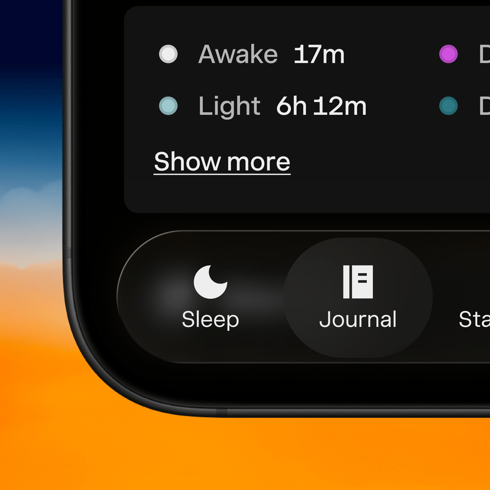
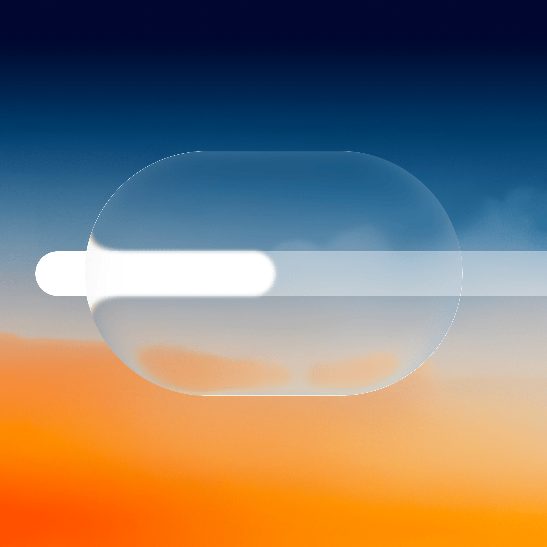
Using Liquid Glass, Sleep Cycle’s UI features translucent controls that float over ambient visuals. The alarm dial, snooze button, and nightly summaries are presented with a soft glass-like sheen that never intrudes, letting sleep insights emerge quietly at the edge of perception. This delicate layering fosters a non-invasive experience, where functionality is present but never demanding.
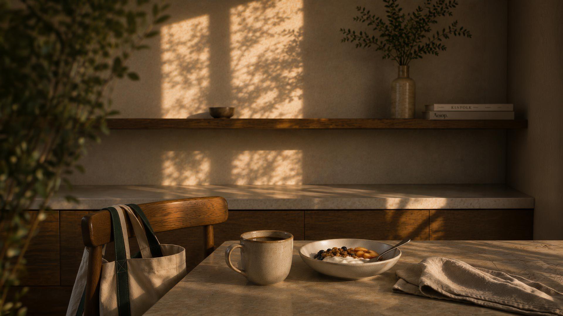
By adopting transparent UI, Sleep Cycle creates a calm environment perfect for before and after sleep. At night, the interface subtly recedes, promoting relaxation. In the morning, it remains clear and legible, gently guiding users to wakefulness without overwhelming them. This balance between serenity and clarity supports better sleep hygiene and a more peaceful start to the day.
Apple’s Liquid Glass intelligently shifts between light and dark modes and responds to context. Sleep Cycle’s UI will adapt to ambient light, ensuring readability without sacrificing mood. And like Apple, we include accessibility options—for instance, a “reduce transparency” toggle—for users who prefer more contrast or minimal visual layering .
Sleep Cycle
Sleep Cycle experts, trusted partners and AI